Looking at the in-line editor, I actually prefer the "green boxes" and the tag in the right corner that also detailed exactly which block was being edited. This makes it easy for the client (and me) to see exactly where the edit areas are, and if they would rather use the Pulse Dashboard (especially with "mixed content" blocks) exactly which block to use.
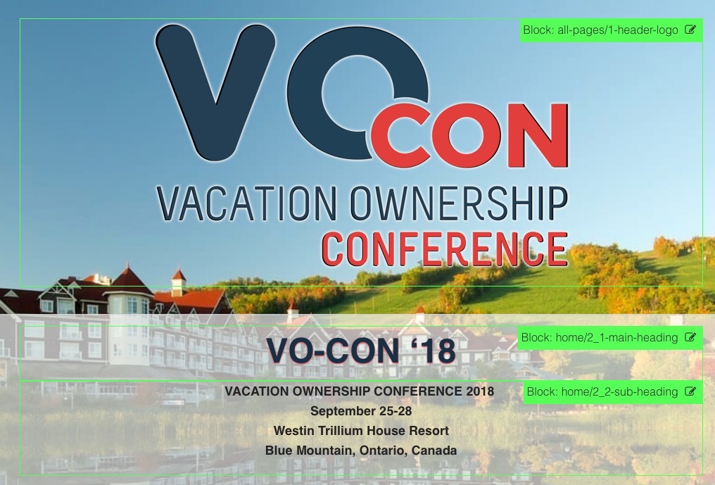
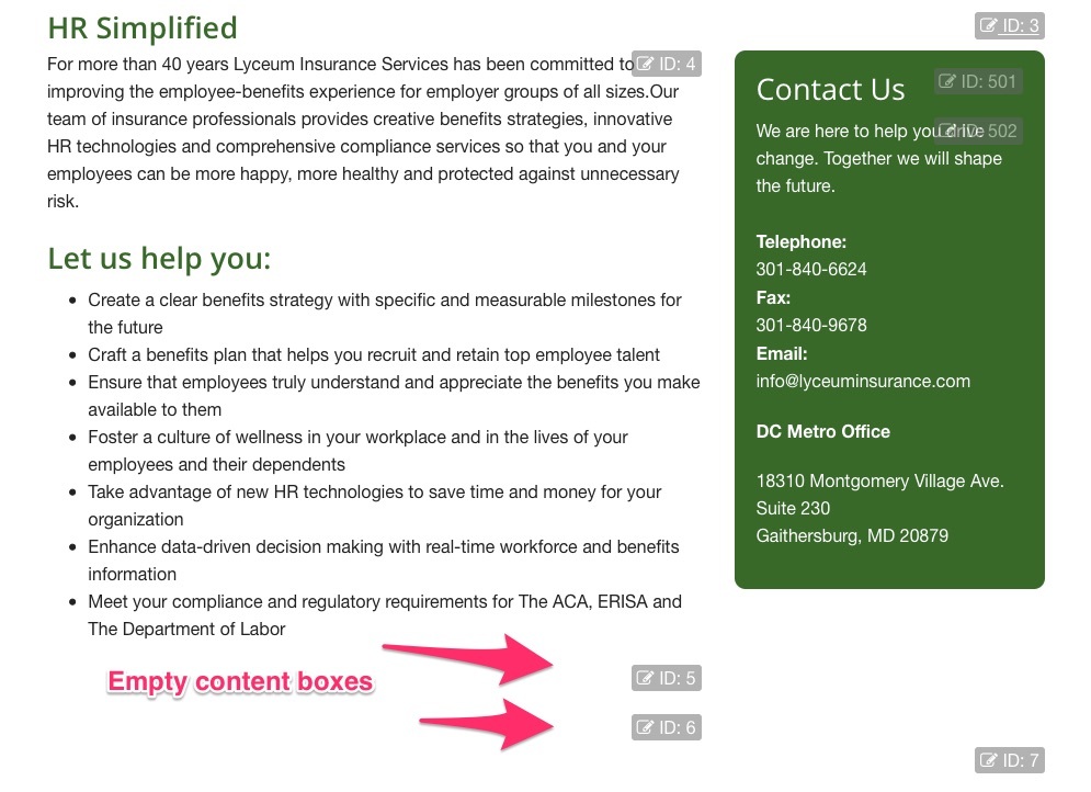
I'm not sure why "hiding" the edit areas is necessary. Or maybe an option have either one. I have attached 2 pics, one showing what the edit areas looked like in Pulse 5.0.3 (with green boxes), and what they look like now in 5.1(with no boxes until you click, and never any info as to what block it is)
@pulsecms That’s unfortunate, and personally I think a step backwards - in “edit mode” it should be easier to see the editable areas, you shouldn’t have to “hunt” for them by clicking all over the page… I like to add “empty blocks” to pages so that the client can add extra content if they like, but in Pulse 5.1 these areas can’t be seen (or clicked on…)
I also sometimes have “universal blocks” like logos or footers that are kept in separate folders than the “page” blocks (in the attached pics above, notice the “Header logo” block is in the Block folder “all-pages” while the page content blocks are in a “home” folder). Again, under the old edit system, it was easy for anybody to quickly find the block in the dashboard, now there is no info provided at all in the in-line edit mode…
This also is important for “small” blocks, (I like to put headings in separate blocks that have special formatting applied to them) In the “in-line” editor “small blocks” are hard to edit, so seeing which block it is and then going to the Dashboard to edit them is easier. But if you don’t know which block it is, now you have to search…
even just bringing back the “info boxes” so people know which block they are editing would be awesome!
and if at all possible, a choice of “subtle” mode or “green box” mode, because I definitely don’t like the “subtle” mode…
Thanks @Raimo - this is pretty much how it looked in earlier versions of Pulse5.
We’re always looking to make it better and will do our best to improve this.
For now though, it’s pretty fast and no modal pop-up and some users (especially non-technical) prefer it as it’s just click and start typing (no colours, boxes or ids). “just like editing a page in real” - they said. Some users were put off by the ids and boxes!
Technical users prefer the backend. So we’re catering for those two at the moment.
But always looking at making changes as we go so thanks for the feedback
Well, for more complex pages, it is easier for the “non-technical customers” (the end-user we are building the website for) to see where the edit areas are… and not have to click all over the page to find them… One client hated the Pulse on screen editor so much, they insisted I rebuild the website in Wordpress and the “Divi” editor… and I hate working in Wordpress… I had convinced them to move away from Wordpress, but the “on-screen” editor that you get with Divi is far superior for the end user, so I had to move them back. I am in the process of moving one of their other websites back to Wordpress as well.
I may move a couple of my other websites back to Armadillo as well. I have had a couple of other customers complain that they don’t like the new editor either…
please bring back at least a choice, maybe in the settings to have the ID boxes in the in-line editor
Well we can’t be having that! How unfortunate for them. OK we’ll do our best for this but it might be 5.3 as 5.2 is almost ready and all features locked in.
For the clients, especially on complex pages where there are many “edit boxes” on a page, the back-end editor is not necessarily easy for them to navigate, as different elements may be in different Block folders.
Example:
each page has a dedicated “Block folder” for that page (ex. an “about-us” Block folder) - this folder may have many blocks. It is not uncommon for me to have 20+ editable blocks on a page, and even simpler pages have 10+ editable blocks. So now the client has to figure out which one they need to open and edit… I do my best to give the “block names” a description, but it still takes time to figure out exactly which block.
After they make the edit, you still need to go open the page to see how it looks. And with Rapidweaver you can’t click the “Preview” link in the Pulse Dashboard, it doesn’t work for Rapidweaver sites… so you have open a new tab or window to preview the edit
On top of that, repeated elements (like the footer, contact forms, analytics codes, etc.) will be in a different folder (I usually call this “Block Folder” “all-pages”), but for the client, now they need to know which “Blocks” are in the “page block folder” and which ones are in the “all-pages” folder…
So the “in line” editor is generally easier for them, but if the edit fields are hidden… they just get frustrated when trying to make changes…
But with the front end editing as it is, if they just double-click the text and edit it they don't need to think or understand the Block IDs or how the page is laid out.. that's why it was removed. So it was as simple as possible with little distraction.